

Creation of the LuxLoc graphic charter
LuxLoc
LuxLoc is a rental company for small and large equipment for construction and public works professionals.
The company is located in LAMADAIRE (Luxembourg).
Our expertise
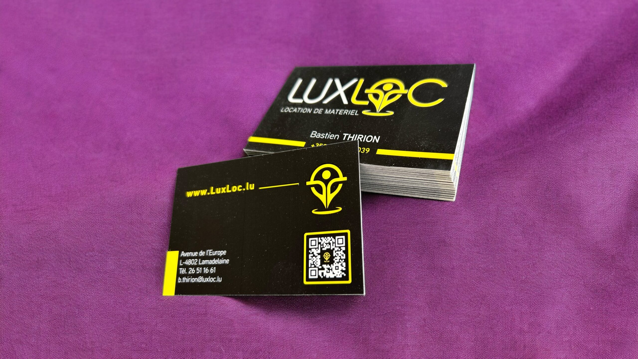
The logo created for LuxLoc is rich in symbolism and meaning.
Here is a detailed explanation of its various components:
-
A man with open arms welcoming :
-
The stylised "O" in the centre of the logo represents a man with open arms, symbolising LuxLoc's warm welcome and openness to its customers. This element reinforces the idea of a company that is accessible and attentive to its customers' needs.
-
-
The 2 Ls in the name LuxLoc :
-
The same 'O' also incorporates the two LuxLoc 'L's, visually linking the company name to the central symbol. This creative integration strengthens brand recognition while remaining true to its visual identity.
-
-
A geographical point :
-
The lower part of the logo ends in a point, evoking a geographical point on a map. This symbolises LuxLoc's ability to deliver and hire its machines anywhere in Luxembourg, underlining the scope and flexibility of the company's services.
-
-
Movement and dynamism :
-
The rounded base of the pointed symbol suggests movement and dynamism, in contrast to immobility. This reflects LuxLoc's commitment to constant evolution, always looking for new ways to improve customer satisfaction.
-
By combining these elements, the LuxLoc logo successfully encapsulates the spirit of the company: a welcoming and dynamic company, capable of meeting the varied needs of its customers with a strong presence throughout Luxembourg.
LuxLoc
Avenue de l'Europe
L-4802
Lamadelaine (Rolleng)
http://www.luxloc.com
Tel. +352661662039
contact@luxloc.com
LinkedIn :
Do you like this design?
Share it on your social networks.
Thank you very much!